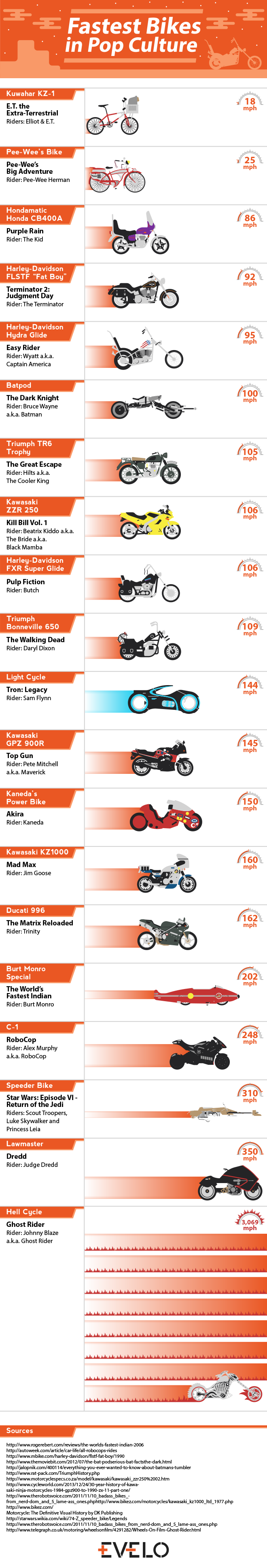
As a science nerd, I love graphs. So this post is an excuse to share the work of Bo McCready.
So who doesn’t love having their favourite show suffer under the inability of the creators to care enough about finishing it properly? Whether it be show runners wanting to do something else, off-set controversies requiring massive changes to the show, or the writers being told they have 8 episodes to wrap up all the intricate characters and plots in a satisfactory way as they join the dole queue, show endings can suffer as a result.
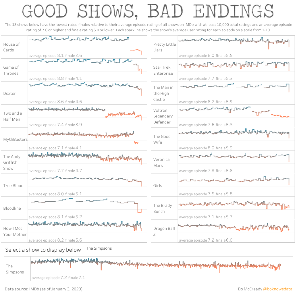
If you go to the Tableau page you can interact with these graphs. You can see the version I’ve saved includes The Simpsons and its slow decline since seasons 5 and 6, that has you questioning how it is still on air 25 seasons later. But you have the ability to add any show.
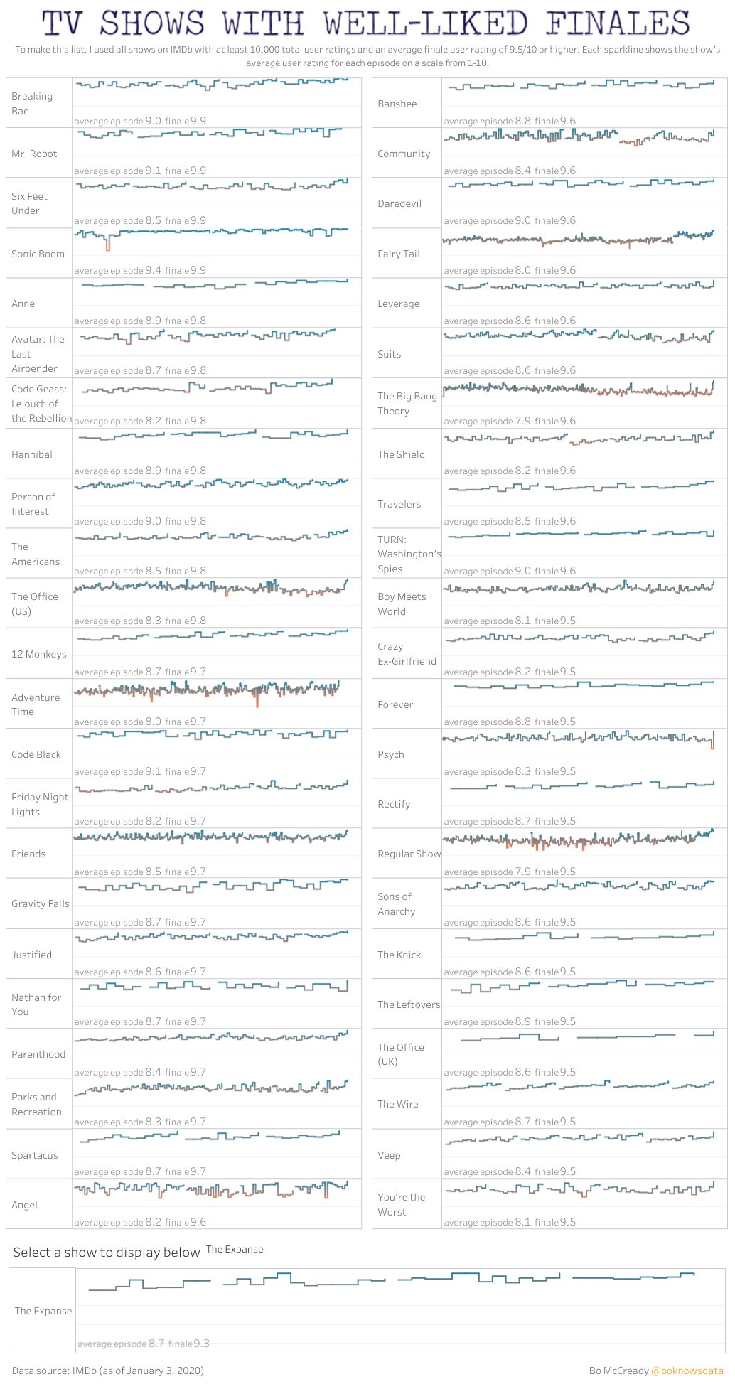
You can also look at Good Shows with Good Endings. It’s interesting to browse through the list to see several of my favourites: Banshee, Justified, The Wire, Leverage, and Person of Interest. In this graphic I’ve added The Expanse, which has the interesting trend of getting better with each season and finishing at its peak.
As with all data, it is important to take onboard the limitations of this presentation.
Take for example the widely loved mediocrity that was Friends. A highly rated show with a highly rated finale whose entire run could be described as middling entertainment. You can see that largely unchallenging, unengaging, inoffensive entertainment has more of a chance to keep its audience happy.
Another example is Game of Thrones. Hey, remember that show? It was only two years ago. Remember how this pop culture phenomenon died and hasn’t been spoken about with anything other than derision since? I’ve gone into how the final season and finale didn’t manage to meet fan expectations, but worse than Baywatch, How I Met Your Mother, and [insert literally any sitcom ever here]?
I think the takeaway from these graphics is that people need to watch an episode of According to Jim or Big Brother to remind themselves that even at their worst, your favourite show was a well crafted gem.